
Is good design subjective? What “beauty is in the eye of the beholder” leaves out.
Give two people the same poster. One admires the lettering; the other struggles to read it. Their reactions tell us something about taste. Whether the poster communicates its message is another question.
Good design is partly subjective. People disagree about what looks beautiful or familiar. A design also has a job to do. We can find out whether its message comes across, whether people can use it and whether it works in the setting it was made for.
On this page8 sections
David Hume was wrestling with this problem long before graphic design had a name. His writing on taste accepts the force of personal response while arguing that experience and careful comparison can improve judgement. Looking closely teaches us things that a first impression might miss.
Think about a sign in a railway station. You might dislike its typeface and still find your platform without hesitation. Or you might admire it and take the wrong turn. Both reactions tell us something, but only one tells us whether the sign helped you get where you needed to go.
A painting can leave its meaning open. A departure board has less room for mystery. Posters and logos often sit somewhere between those extremes: they need to leave an impression while communicating something specific.
The saying “beauty is in the eye of the beholder” makes sense when somebody tells you what you ought to find beautiful. It offers less help when a client wants to know whether an interface is understandable.
Why the same design can split opinion
What looks obvious to a trained designer can be unfamiliar to someone encountering it for the first time. Our expectations come from the things we have seen and used before.
Familiarity and processing fluency
In a 2004 review, psychologists Rolf Reber, Norbert Schwarz and Piotr Winkielman describe processing fluency: the ease with which we make sense of what we see. They propose that the more fluently we process something, the more positive our response, and they link symmetry, repetition and typical-looking forms to that fluency. That does not give us a universal recipe for beauty.
Imagine the lettering on a bank statement. Familiar shapes may feel reassuring there. Put similar lettering on a music festival poster and it might seem dull. Part of our reaction comes from what we expected to see.
Culture and experience
Katharina Reinecke and Krzysztof Gajos analysed 2.4 million ratings of website appearance from nearly 40,000 people. Their 2014 study found differences in preferences for colourfulness and visual complexity. A 2018 review of cross-cultural research concludes that people from different cultures also base their preferences on a common set of formal features, including symmetry and complexity. Background matters, though it cannot explain every preference.
Colour offers a familiar example. In their ecological valence theory, Stephen Palmer and Karen Schloss propose that the objects we associate with colours help shape our preferences. The same shade may call up different memories for different people.
The pleasure of spotting an idea
A hidden form in a logo offers a small reward for paying attention. Spotting it can make the mark memorable. It also takes a moment to decipher, which may be fun on a poster and frustrating on a sign you need to read quickly.
Four designs worth a second look
These four pieces make the connection between appearance and purpose easier to see. Each attracts attention for a different reason. Each also raises questions a photograph alone cannot settle.
Daren Newman’s Tokyo 2020 concept: a visual riddle
Daren Newman’s unofficial Tokyo 2020 concept turns the Olympic rings into the date itself. A red disc refers to Japan’s flag. Spotting the idea is satisfying; how quickly you spot it is another matter.
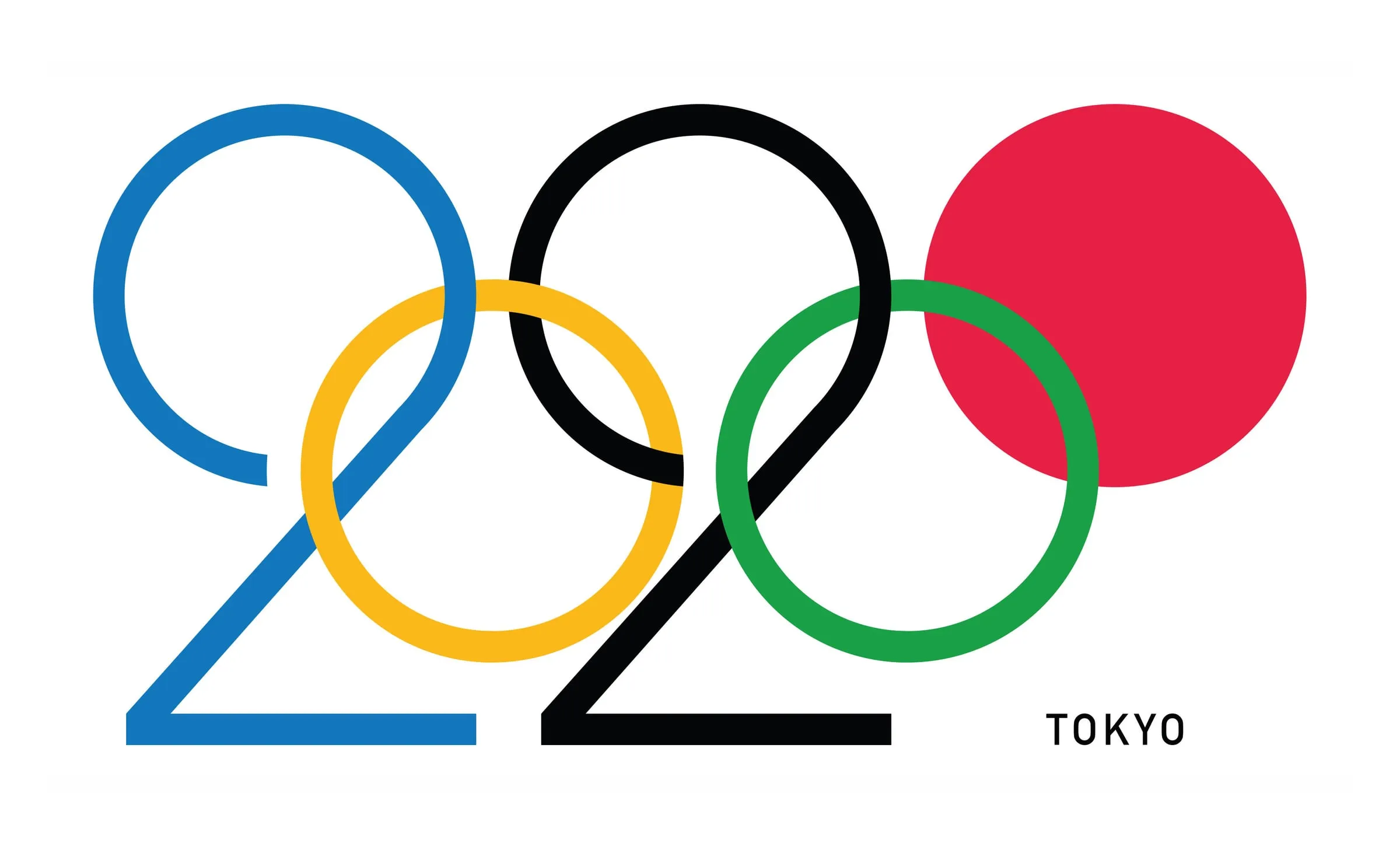 An unofficial Tokyo 2020 identity concept by Daren Newman. Source
As a visual riddle, the concept has charm. Now imagine having to recognise it at a distance, perhaps while moving through a busy venue. Would the lettering still register quickly enough? Newman’s proposal was independent of the official Olympic identity, so that question remains a thought experiment.
Barbara Galińska’s Stop War: letters under pressure
The words in Barbara Galińska’s Stop War poster stretch and crowd the page. Reading them takes effort. That resistance can make the message feel more urgent, because the lettering carries some of the agitation we associate with the subject.
 Stop War, a calligraphic poster by Barbara Galińska. Source
A protest poster has room for expression that an evacuation notice does not. The interesting question is whether the effort to read this one draws people in or keeps the words out of reach. Its setting would make a difference.
Braun TP 1: a calm-looking machine
The Braun TP 1, designed by Dieter Rams in 1959, brings a transistor radio together with a portable record player. In a photograph, its arrangement looks spare. Circles and straight edges do most of the visual work; the controls barely interrupt the surface.
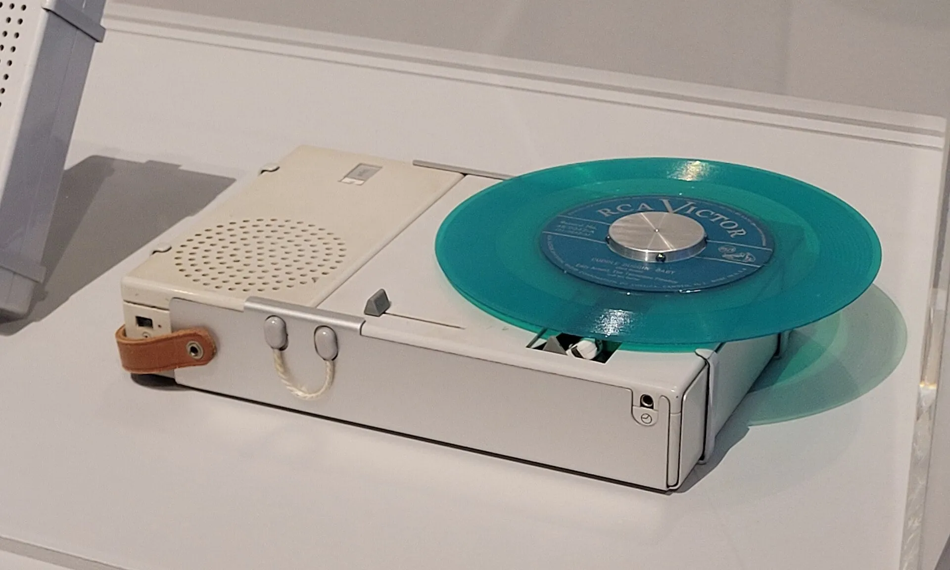 Braun TP 1 (1959), designed by Dieter Rams. Superraptor123, CC BY-SA 4.0. Source

It is easy to admire that restraint from a distance. To learn how well it works in practice, you would need to pick up the TP 1, operate its controls and listen to it. A photograph tells us very little about that experience.
Hangerpak: when packaging becomes a hanger
Steve Haslip’s Hangerpak begins as a mailer. Fold it along the printed instructions and it becomes a clothes hanger. There is something pleasing about seeing the packaging put to another use, especially when the transformation is clear from the illustrations.
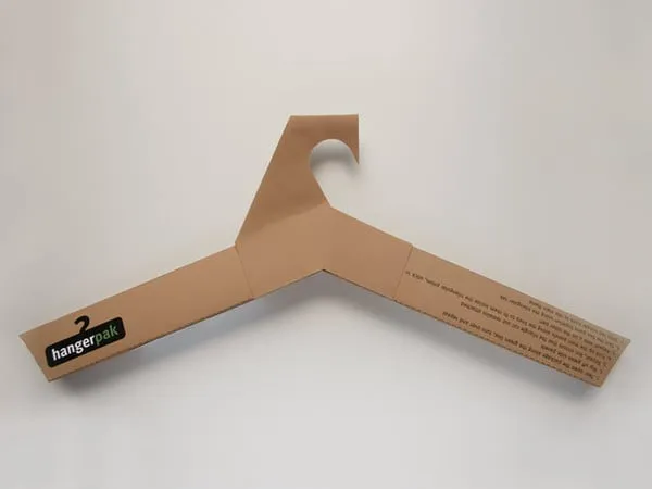 Hangerpak, a mailer that becomes a clothes hanger, by Steve Haslip. Source
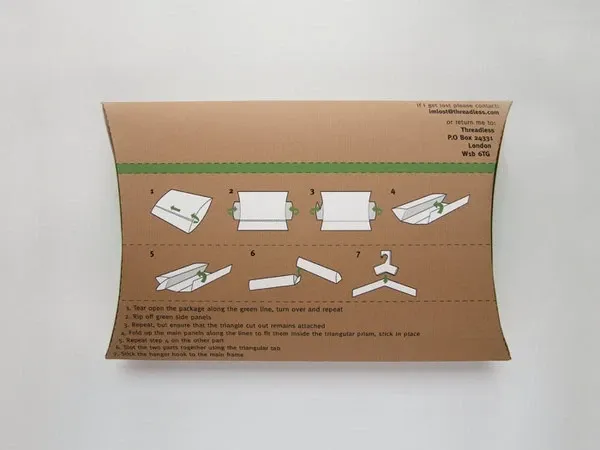 Its folding instructions. Source
The appealing idea raises a less photogenic question: would people actually keep and use the hanger? The concept images cannot tell you.
Can an attractive design still be bad design?
Certainly. Imagine a restaurant menu with beautiful typography that is too small to read in low light. Or a polished checkout page where people cannot find the payment button. They may look appealing and still make an ordinary task harder.
The aesthetic-usability effect helps explain why appearances can cloud our judgement. People often expect attractive interfaces to be easier to use and may forgive small frustrations, though not large ones. As Nielsen Norman Group explains, perceived usability is different from what people can actually accomplish.
Consider a timetable that tells you exactly where to stand and when to leave. It may attract no praise for its style. Yet helping people find the right departure at a glance is design work worth noticing.
How can we judge good design when taste is subjective?
Start with the brief. What should happen when somebody encounters this work? Then look for evidence that it helps people do what they came to do.
- The task. Is this meant to be noticed, read, remembered or used? Decide what success looks like before debating style.
- The people. Who is it for? What do they already know, and how quickly do they need to act?
- What people understand. Show the work without explaining it. Notice which message they pick up first.
- What people can do. Watch someone use it. For digital products, check accessibility against WCAG instead of relying on how accessible the interface looks.
- What it takes to make and maintain. Materials, cost, durability and ongoing care can alter the judgement of an otherwise attractive idea.
The ISO 9241-11 definition of usability is precise about this: effectiveness, efficiency and satisfaction depend on particular users, goals and settings. Those are more useful things to investigate than a single score for beauty.
Dieter Rams’s principles of good design offer another way to look at the problem. He places usefulness and honesty alongside aesthetic quality. They are influential principles, though they do not settle every argument about taste.
What to do when people disagree about a design
Design reviews become messy when every reaction is treated as the same kind of feedback. “I don’t like green” is a preference. “I couldn’t find the main action” is a problem you can observe. “Our customers would find this too formal” is a claim that needs checking with customers.
Ask people what they understood before you explain what you intended. On a website, watch where they click. With printed work, notice what they see first and what they remember later. Keep the original brief in view.
Someone will always have a favourite colour. What matters for the design is whether the colour helps the people it was made for.
What the eye of the beholder misses
“Beauty is in the eye of the beholder” is a sensible answer when somebody dislikes your favourite poster. It is a poor substitute for a design review. The more interesting questions concern why the work appeals to us and whether it holds up in the situation it was made for.
We can enjoy a clever typographic trick and still ask whether the words can be read. We can admire a quiet piece of industrial design and wonder how it feels in the hand. Taste opens the conversation. The people using the design, and the demands placed on it, give that conversation somewhere to go.
Questions
Is design entirely subjective?
Design is not entirely subjective. Our response to its appearance varies from person to person, for reasons that include familiarity, experience and culture. Whether people can read a label, navigate a page or complete a task can be checked by watching them. Both belong in a design critique, though they are different kinds of feedback and should be kept apart.
What makes a design aesthetically pleasing?
Familiarity, ease of perception, experience and culture all shape whether a design looks pleasing. A 2004 review by Rolf Reber, Norbert Schwarz and Piotr Winkielman describes processing fluency, the ease with which we make sense of what we see; they propose that the more fluently we process something, the more positive our response, and that symmetry and repetition raise fluency. Preferences also differ with background, and research has not produced a single look that everybody finds beautiful.
Can a design be objectively good?
A design can be objectively good in part, judged against the job it was made to do. Parts of its success against the brief, such as recognition or task completion, can be measured. The ISO 9241-11 definition of usability ties effectiveness, efficiency and satisfaction to particular users, goals and settings. Aesthetic value still involves judgement and is harder to reduce to a score.
Why do people disagree about logo or graphic design?
People disagree about logo and graphic design because they bring different experience and expectations to it, including what a brand should feel like. A logo may reward someone who spots a reference and frustrate someone who needs to recognise it quickly. Daren Newman’s unofficial Tokyo 2020 concept turns the Olympic rings into the date; spotting the idea is satisfying, but how quickly you spot it is another matter.
Does better-looking design improve usability?
Better-looking design can make an interface feel easier to use, which is not the same as being easier to use. Nielsen Norman Group calls this the aesthetic-usability effect. People often expect attractive interfaces to be easier to use and may forgive small frustrations, but perceived usability is different from what they can actually accomplish. To find out, watch people use it.
Sources
- Hume’s Aesthetics
- Reber, Schwarz & Winkielman: Processing Fluency and Aesthetic Pleasure
- Reinecke & Gajos: Quantifying Visual Preferences Around the World
- Che et al.: Cross-cultural Empirical Aesthetics
- Palmer & Schloss: An Ecological Valence Theory of Human Color Preference
- The Aesthetic-Usability Effect
- Dieter Rams: ten principles of good design
- Web Content Accessibility Guidelines overview
- ISO 9241-11:2018 Ergonomics of human-system interaction, Part 11: Usability: Definitions and concepts